I chose a template that had quite a neutral tone to it with pastel colours, the background was also cartoon clouds which I thought fit well with my music video. After looking at the codes and conventions of websites and creating my mockups, I had a clear idea of what I wanted my website to look like. It also helped a lot during the process that I had drafts of my music video and digipak avalible, this acted as second and third references that I could look back on and make sure it was all flowing together and had continuity throughout my products.
To start off, I created the main title for my website. I wanted to use blue and white as a house style colour throughout all 3 products so I simply used the brush tool in Photoshop and set the opacity to 20% on the blue colour. I then painted diagonal lines across the page which appeared really light. After this I changed the opacity to 50% and did the same thing, and then once again changed the opacity to 90% and once again drew diagonal lines across the image. Doing so created a sky like texture so the background wasn't just a solid blue colour which I think would look boring. To add the text, I used the font which I also used in my digipak, I downloaded the font from DaFont.com as I wasn't too keen on the preset fonts on Photoshop, the font also had a unique 'handwriting' look to it which I liked.
Thinking back to my AS coursework, I remembered having 'EXCLUSIVE!' in black writing on a solid yellow background, this immediately attracts the audiences attention and will especially stand out on my blue and white themed website. I wanted to include this again as I think it will show the importance of the new music video to the audience and make them feel like they part of an exclusive update. I added a drop shadow to add more depth to the image, and simply used the same font again in black.
Draft 1:
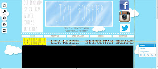
First draft of the top of my website so far. I added some text under the main heading which says 'DEBUT ALBUM OUT NOW!' 'NEOPOLITAN DREAMS' I thought this would automatically grab the readers attention, placing it under the header seemed a good option as it's the first thing the audience see when visiting a website, so placing it under the header will show it's an update and new. I still need to change some of the writing on my website as it's preset from the wix template.
Draft 2:
I decided to add some plugging techniques and social networking sites to my website to make it appeal to active audiences and also younger audiences. I simply created a text on Photoshop that reads 'GET INVOLVED! FOLLOW LISA! TWITTER YOUTUBE INSTAGRAM' I then on the right hand side placed 3 icons. However, looking back at it is looks quite messy and I think I can definately improve on this. I also realised I wrote 'Youtube' but didn't add a Youtube icon, and I also included a Facebook icon, but didn't write 'Facebook'. I have also embedded a link to my final music video (not currently the final video but will change the embed link once finished)
Draft 3:
I decided to change the social networking text and imagery on my website. To do this I simply opened up Photoshop and chose a more bold font that would stand apart from the handwriting font for the main header. I then saved the icons for Youtube, Instagram, Facebook and Twitter and cropped these into the file. I chose to use these particular social networking sites as I think they are the most popular, especially to the younger audience.


No comments:
Post a Comment