Now that I had all my research and planning - I started to construct my digipak.
FRONT COVER:
Initially, I had the idea to hand write the digipak title on my graphics tablet, however once I tried this out I realised it didn't look as professional as I had hoped.

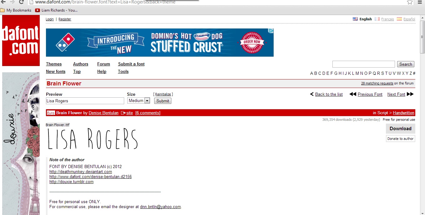
I then went on to visit the site 'Dafont.com' to look at different fonts which would work well in my digipak. As my video has sketchy drawing in it, I wanted to keep this theme running throughout, so I looked under the 'handwriting' category on the website to experiment with a few fonts. 'Da font' was really helpful as I could type in anything as a preview before comparing and downloading the font to use.
Test fonts...



I then started experimenting with the photos I had took whilst filming. At first I wasn't sure if to rotoscope the image or hand draw it and then scan it in and maybe add some thicker, sketchier lines, so I experimented with both.
Hand drawn drawing of Lisa:
(explain)
I decided to rotoscope the chosen image and add colour to it so it had both elements of my music video featured in it - the colour and also the animation. To do the rotoscope on the photo, I simply used the 'lasso magnetic' tool to crop out the background to be left with the original image.

Then, I created a new layer

After doing this, I used my graphics tablet to draw over the original image - making sure I was always clicked on the BLANK layer when drawing, so I wouldn't be drawing over the original image. I then started to add colour to the rotoscope drawing and also tone and shade by simply using a slightly dark/lighter colour and blending it with the 'smudge' and 'blur' tool.

I carried on doing this process until I was happy with the outcome. I then changed the background colour to a pastely neutral yellow so it wasn't a solid white and had a slight colour to it. I used the brush tool to add random lines in the background. I did this because doing so reminded me of a school/college book when you're doodling and thought it may attract my audience more as they are in the 16-24 category. It also fit with my music video as it's all very sketchy and doodley. I added the artists name and album name at the top of the digipak, and then rubbed out the background so it looked like white clouds which are also featured a lot in my music video. I typed 'LISA ROGERS' in capitals as I wanted her name to be the 2nd main focus - Lisa is the main focus which is why she is central and takes up most of the cover.
Draft 1:

Draft 2:
I decided to change the background slightly as I felt it was missing something, so I once again used my graphics tablet to draw spontanious circles on my front cover background. I like this one more as it has more character to it and the red fits with the mise en scene of my video alot, as my artist has redy brown hair, a red skirt in my video, and red also signifies love which is what the lyrics are about. Using red will help the audience recognise the cover more as it's very eye catching and abstract.

Draft 3:
I did some more research and asked for some opinions on my digipak and realised that the main texts would look a lot better at the side of the digipak.

Draft 4:

I changed the skin tone and drawing a little on this draft as it looked disproportional and too pink.
Draft 5:

After getting some constructive critisism from my audience I decided to change the background and text of my digipak. The background looked too loud and vibrant, although my genre is indie pop, the song has a delicate feel to it and I think the background was too over the top and colourful. I decided to tone down my cover and create a white background, I then used the 'blending options' and chose a 'pattern overlay' I looked through the present Photoshop patterns and too my surprise it had a pattern that I felt worked well with my photo. The pattern is a pastel blue colour with a slight texture to it. I think this looks a lot better as it's not as overpowering and doesn't take the focus off the album name and photo. I also decided to keep the 'doodle' feature on the cover but tone it down by just using black lines, this also helps my main product and ancillary texts to relate more as in my music video the majority of rotoscope animation is in black and white. I also decided to change the text colour to a deep red to match my actresses mise en scene in the video and also her hair colour. I'm happy with my final cover as it's not too overpowering yet has an alternate individual look to it compared to conventional indie pop covers.
Draft 6:

I've changed the image a little as I think it looked a bit scary...
Draft 7:

I decided to try use the original image as I wasn't sure if the animated version worked well on my cover. However, I feel like the image on this one is out of place, so I'm going to ask my audience what they think of this draft.
Draft 8:

I've started to try out a more simple idea after taking inspiration from the band Never Shout Never and Jason Mraz. After asking the audience their opinions on which album cover to use, the majority advised me to go with the bottom as it was simple and different. It also was an image directly from the music video which will allow the audience to recognise straight away the connection from the music video and the album. However, I need to thicken up the text as it's quite hard to see without looking close up.
Draft 9: FINAL

After adding the final touches to my digipak cover I'm happy with the final outcome, it's fresh and alternate -fitting to my niche audience's needs.
INSIDE DIGIPAK:
CD DISK
Draft 1:

Draft 2:
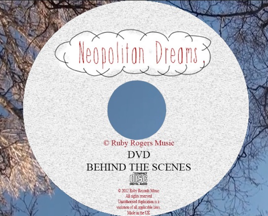
For the CD part of my digipak - I once again used a still from my video, I chose the point where I used a POV shot of my artist looking up at the sky. I liked this shot as the brances and leaves where all in a sort of circle in the sky - giving me enough room to have my CD designs in the middle where the sky was. Another reason I chose this image is because it followed the house style of using blue and white, whilst also fitting with the indie 'nature environment' stereotype.
For the actual CD's I decided to create the same design, but create one CD for the music, and one DVD for extra features such as behind the scenes footage. I did some background research on what needed to be included on the CD by looking at pre made CD's from Beyonces work and a general CD I found on Google.

+(CD).jpg)
I then applied this info to my own CD and DVD...
Draft 1:


 Final 2 disks

Inside left image
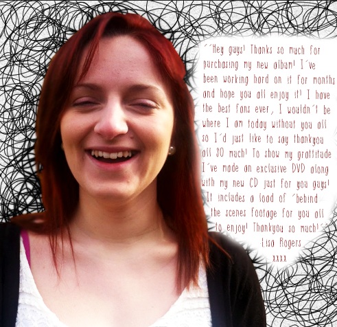
As I wanted the audience to feel more involved in my artists life and the products, I decided to add a personal message from the artist to the audience on the image I was using for the inside of my digipak. I use a draft I was going to use for my front cover as it was the photo I wanted to use and hand hand drawn animated scribbly lines in the background which fit with the theme of my products. This is the message I wrote on the image...For the CD part of my digipak - I once again used a still from my video, I chose the point where I used a POV shot of my artist looking up at the sky. I liked this shot as the brances and leaves where all in a sort of circle in the sky - giving me enough room to have my CD designs in the middle where the sky was. Another reason I chose this image is because it followed the house style of using blue and white, whilst also fitting with the indie 'nature environment' stereotype.
For the actual CD's I decided to create the same design, but create one CD for the music, and one DVD for extra features such as behind the scenes footage. I did some background research on what needed to be included on the CD by looking at pre made CD's from Beyonces work and a general CD I found on Google.

+(CD).jpg)
I then applied this info to my own CD and DVD...
Draft 1:

Draft 2:

Draft 3: Final


Inside left image
‘’Hey guys! Thanks so much for
purchasing my new album! I’ve
been working hard on it for months
and hope you all enjoy it! I have
the best fans ever, I wouldn’t be
where I am today without you all
so I’d just like to say thank you
all SO much! To show my gratitude
I’ve made an exclusive DVD along
with my new CD just for you guys!
It includes a load of ‘behind
the scenes footage for you all
to enjoy! Thankyou so much!’’
-Lisa Rogers.
xxxx
Final draft for inside left image:
Booklet:
I wanted the booklet to be really simple as the information was going to be mainly inside.
I decided to take a screen shot from the music video and blur it out and just add my artists name.
Here is the image before blurring it...

Here is the image after blurring it...

I decided to use the same font once again to make sure continuity was followed. I also decided to use the brush tool to add a white background behind the font, I slightly changed the opacity to 90% so it wasn't fully solid white and was more softer on the image.
Here is my final design for the booklet:

I originally wanted to use this image of my artist walking in my back garden for the back cover, however, I've used a lot of animation throughout my digipak and I didn't think it would fit well.

I was going to use this image for my backcover and blur it to add the writing. I thought this might look good as the front cover and back cover would look the similar but the houses would be on opposite sides. However, I decided not to go forward with this idea as the front and back would confuse the audience too much.

Image after changing levels:

I then decided to blur the image so the test was easy to read on the back cover.
Image after blurring:

I needed to create a institutional information on the back of my album cover. So first I created a logo for my artists record label. As I'd wrote ''(C) Ruby Rogers Music'' on the CD's, I decided to use a Ruby gem as the record label logo.
I created the gem shape using the lines on Photoshop and then filled it in red. I then went to blending options to add some textures and shadows to make it look more realistic.
I chose a present texture that was available on Photoshop and changed the scale and depth to fit my gem.
Logo:

''WRITTEN AND PRODUCED BY: LISA ROGERS
EXECUTIVE PRODUCER: ANDY RICHARDSON
LISAROGERSMUSIC.COM RUBYRECORDS.COM
© 2012 RUBY RECORDS
All rights reserved
Unauthorised duplication is a violation of all applicable laws.
Manufactured in the UK''

Next I needed to add the price and track names. I decided to sell my product for £7.99, this is because I knew my audience were dominantly 16-24 and were students so didn't always have spare cash. I also noticed a lot of albums on iTunes were sold for this much - which made sure I wasn't under selling or over selling my product. I decided to place the price at the top right hand corner in a yellow shapes circle - this was so it would catch the audiences eye when they started reading down the back cover.
I also decided to add an 'EXCLUSIVE!' in yellow with a black background to try encourage the audience to purchase the digipak. I also thought if I wrote 'exclusive' it would make the audience feel more involved in the product and it may also attract them as they could want to find out more about the artist.

I then decided to use cross hatching behind the song names with my graphics tablet to carry on the sketchy look of my products.

FINAL DIGIPAK


.JPG)


.jpg)


